Posts

My what a sexy font you have…
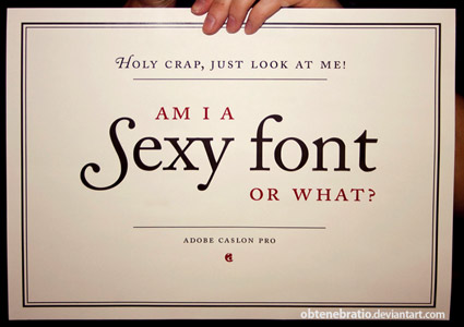
Fonts are the voice of your website.  They reveal your personality, or the personality of your site.  Your font needs to match the topic, content and feel of your site. So what is your font personality? Sexy, playful, provocative? Mysterious, classic, cold or impersonal? Mature or immature?

Fonts are the stepchildren of web design. When you create a blogsite (which I recommend over a regular website) you primarily focus on graphic design. How does it look?  Do the colors go nicely together?  Do your sidebars look cool? Does your home page grab you?  Font is usually a secondary or tertiary consideration. Often it is not even a conscious decision; people will just accept whatever the default font is.  There are people in typography who feel that your choice of font is a representation of your personality.  I wouldn’t go that far, but your font does send a message.

“Typefaces are the clothes words wear, and just as we make judgments about people by the clothes they wear, so we make judgments about the information we’re reading by the typefaces,” typography analyst Caroline Arche

Size Matters

Size does matter when it comes to fonts.  A smaller font conveys power and authority. A large font indicates immaturity. So in general smaller is better, unless it is too small to read.

Font Type

The type of font you choose sends a message.  Professional but traditional? Use Times.  Professional but contemporary? Use Verdana. Courier New says cold and unfeeling. Times New Roman is a good compromise between traditional and modern and generates feelings of trustworthiness. If you want something flirty and fun, then pick something with big circular O’s and swooping lines.

“Courier is the sensible shoes of Fonts.”

Font Color

The color of your font is extremely important, especially in relation to your background.  How many times have you gone to a page and had trouble reading the writing because of the font color?  People may have difficulties reading what you write because of vision issues,migraines, or forms of color blindness.  But if someone is struggling with reading what you wrote because they cannot see it easily, they will not stay on your page.

  • Do not place small white text on black backgrounds. It is visually very difficult to read.  The letters blur together and become indistinguishable, or seemingly move around. (This is one time where larger font size is better).
  • Red text on a yellow background is like a seizure for the eyes. It actually creates a holographic effect.
  • Blue text on green background or green on blue background should be avoided.  Often the words will just melt into the background and some people won’t be able to see them at all.

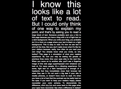
a block of white text on a black background showing how white text is hard to read

A demonstration of how white text is hard to read

The best font to use is black text on a white, light gray, light cream or light tan background.  It is the easiest to read.  Ultimately it is most important to make sure people can read what you write, then consider what your font says about your web presence personality.

Hashtags: #fonts #typeface #blog
Nice Form Baby! Too bad I can’t read your blog.

bedazzled pubic area and it spells <hr/>

Sexy HTML code: <hr/>

Form over function?  This is an essential life question.  But let’s just look at this question in relation to your blog or website.  A website is a balance between form and function. You want it to look beautiful but you want it to be usable. If you cannot read it, can’t navigate it or can’t understand it, then what is the point?

Navigation is a key issue everyone talks about.  People have to be able to move easily around your site. They have to be able to find where they are supposed to go.  Selling products? They must be able to figure out how to buy.

Ads can clutter up a page.  We have all seen sites where there are so many ads we cannot distinguish the site content from the advertising content. 10 years ago that might have worked – to get people to randomly click ads as they were trying to find their way to the content they were looking for – it doesn’t really work now.  We are all much smarter than that. Most of us know not to indiscriminately click on ads in a web page and if we see a page that is so overrun with ads as to be confusing, we just leave.

Content is King. Ultimately, once people have figured out how to move around your site without being bombarded with ads, then your ability to convert your people into readers, subscribers, followers, fans, clients, sales, customers and colleagues is the quality of your content.  It must be relevant to your topic, informative and interesting. It must be written well and checked for grammar and spelling.

If you are an adult star you might be thinking, my content is primarily video and images.  The same rules apply.  The parts of your site that include text must have good text.  The part of your site that has images must have good images.

Images. Your images must come through. They need to be sized properly for fast loading and if they link, the link must be good.  A bonus you could add would be to write good alt tags, so that screen readers can read  a good description of your image to a blind viewer.

Frequency. Quantity is almost as important as quality. If your site is based on communicating information and you update sporadically you will not build a solid audience.  You need to be regular with your updates, even if the information is pictures or video.  Set a schedule.  If people know that you update weekly, three times a week, daily, twice a day, then they are more likely to come back to see your updates (here is where quality comes into play). This will build a loyal audience which can translate into a loyal customer base.  But they have to be able to rely on you before you can rely on them.

Though form is important, function will ultimately prevail.  Your audience will stay longer and come back more often if you provide them with quality content. If your site only has a pretty face then you might get someone who comes once, but they won’t come back.  A pretty face will get people to the door; it won’t deliver the sale.